“Good design is Good Business”, as quoted by Thomas John Watson Jr. (IBM) really throws light on the importance of design in any kind of business. Being a web design and UI/UX design agency, we know that design doesn’t restrict to fashion or product, but encompasses books, brochures, posters, store windows, or a simple mundane visiting card. In recent years, people have become aware of the need for good design. A revolution in design brought to us by various brands is making people aware of the importance of design and how it can help businesses reach new and higher heights.
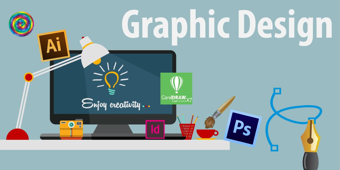
So our question is: What is Graphic Design?
It’s not just designing fancy graphics on social media or make a jazzy poster. It is a combination of verbal and visual display integrated to make the product unique. It is a solution to a problem. Although design can be as groundbreaking as possible, it is something that is very perishable.
Why perishable?
Well, it’s the trends in the market that drives the graphic design industry. The perennial need for designers to create something new and different is what governs the design world. This constant requirement for change acts as a catalyst for various new design trends to be born and breaks the boundaries of the ordinary.
Some of the trends that really caught my eye over the past few months are Wave Effect, Double Light, Double Exposure just to name a few. The Wave Effect has literally created waves in the design space. The creative visual distortion or the disturbance created in the image is what captures the attention of the user while viewing. The Double Light effect, on the other hand, is an effect that uses two different colors that are used for the shadow effect around the object of the image to make the screen or the image come alive. Another trend doing the rounds over the past few months is Double Exposure. This is an effect where the viewer is visually stimulated by the creative imagery that is placed within the framework of a bigger picture, which may be a silhouette or a faded image.

Although these may be the current trends in the design world, here’s a list of a few upcoming graphic design trends that may take over in 2019.
PANTONE LIVING CORAL:
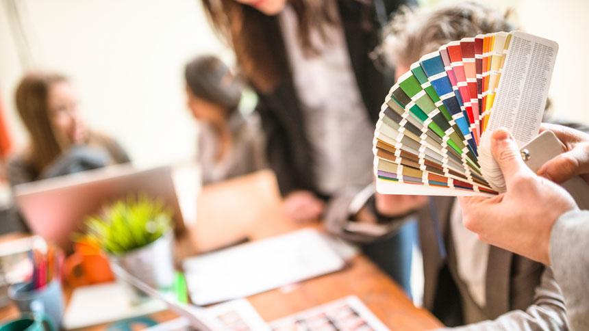
For 20 years, Pantone’s Color of the Year has influenced the design industry. We’re talking product development and purchasing decisions in multiple industries, including fashion, home furnishings, and industrial design, all the way to packaging, and graphic design. The Pantone Colour of the year for 2019 is Pantone Living Coral. A color that is mellow yet vibrant, emits a sense of warmth and nourishment that will surely be incorporated in various designs in 2019.
ASYMMETRICAL LAYOUT:
Gone are the days dominated by Squarespace and Canva and other grid-based templates design that has been the standard for the past few years. Designers are now looking to create products that are more unique in nature, which brings us to Asymmetrical Layouts. With this kind of Layout, the user is intrigued and appealed by the graphics on display as it creates a sense of wonder as to where the information may come from next.
3D DESIGN AND TYPOGRAPHY:
Three-dimensional work isn’t something out of the ordinary, but 3D Typography is something that will be extensively used in 2019. When you think 3D, you think about the pop effect it generates, which is exactly the effect 3D Typography creates when it’s incorporated in texts. The beauty of this kind of typography is that it isn’t restricted to any type of text, rather it can be used for any type of font such as bold, skinny, sans-serif, etc. Beyond typography, we are going to see a lot of graphically designed compositions that will be rendered with the 3D effect, that will make the compositions jump right off the page and make it impossible for viewers to look away.
ART DECO
Art Deco designs inspired from the 1920s are set to blow up in 2019 as well as the following years to come. Having been part of the “Modern” design era that began way back in the 1940s and 1950s, the glamorous 1920s ornamental designs are set to take over. These designs are mainly going to be incorporated in logo work particularly. The complex line and symmetry oriented design scheme can also be influenced in various typographies as well as creating a stark contrast to the rustic work that has been prevalent for the past few years.

LIGHT AND DARK COLOUR SCHEMES
The Dual Colour scheme is a trend that is being followed by major tech companies in 2019 and will be followed by a lot more come to the end of the year. The use of light and dark color schemes is to make the product stand out and even make the poster much more flexible making it more adaptable for any medium or screen.
DUOTONES AND GRADIENTS
Gradients are another trend that is going to take over 2019. Although gradients have been used in the background for various designs earlier, they will now be used in various new ways that are yet to be discovered in the following months. With the vivid colors and futuristic patterns that it incorporates, don’t be too shocked to see these gradients used extensively in various new designs. On the other hand, duotones are another design tactic that fits well with the change in design trends. This trend basically replaces the black and white elements in a photo with two other colors, making it as vivid and colorful and can even match your branding
COLOUR MINIMALISM
Minimalism is all black and white. This is a major misconception that needs to change and by the looks of things might just change in 2019. Breaking down the main design idea with the right colors is the basic essence of color minimalism. With more and more designers trying to reduce the cluttered ideas and only focusing on hitting the nail on the head, color minimalism will be the trend to watch out for in 2019.
HAND-DRAWN ILLUSTRATIONS
Simplicity is what will drive designers in 2019, and Hand-drawn Illustrations is the answer. With brands trying to promote authenticity and really reach out to their respective target groups, Hand-drawn illustrations will help their cause with carefully created illustrations that cannot be duplicated by competitors and make the product exceptional. Hand-drawn single line illustrations have taken Instagram by storm due to their ability to enhance the uniqueness of the product, along with creating content that is aesthetically pleasing and visually stimulating.
ISOMETRIC DESIGN
Unlike open compositions and minimalistic designs, isometric designs create whole universes covering every tiny little space within the design. These designs can mainly be noticed in your icon work, etc where every little intricate detail related to the product can be displayed without any lag due to the smaller file size as compared to the 3D compositions.
BUXOM SERIF
While compositions and illustrations turn lighter with each passing day, the font used for its content is about to get a major overhaul. While Sans-serif has dominated over the past few years and although it isn’t about to stop especially in the digital field, the need to introduce a custom made fonts has become a necessity for major brands. Serifs are about to take over the market and are a major trend that will explode in 2019.
2019 is set to be the year for a major overhaul, especially in the graphic design space. With room for a lot of growth along with room for inspiration, be sure that designers are definitely going to come up with new concepts that may be far more groundbreaking than the ones listed.
2019, we’re ready!


