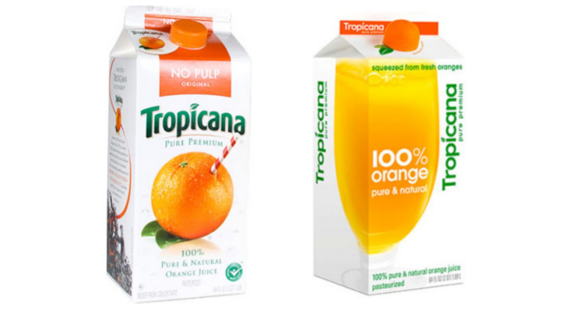
Introduction:
Packaging Design, like so much else, can be as simple or intricate as you want it to be. What’s important is the thought that goes into the art and science of packaging design. Sometimes, a simple, well-designed package can perform much better than something complicated and/or over-designed. Other times, it’s vice-versa. So what exactly is it, then, that makes a good package? Unfortunately, there is no clear answer, but nevertheless, there are several things to consider when you design your next package.

Source: – The Dieline/Judit Besze
- The Key Message of the Product.
The most important thing for you to consider when you design a package is an overall message that the package delivers: This is the product’s key message, and it has to align with the identity of the brand that made the product, as well as with the nature of the product itself. The overall message can be anything. Some examples are cute, luxurious, natural, and so on. When customers are walking down the aisle at a shopping mall, they aren’t going to be scrutinizing the intricacies of the package you took three months to design, and most probably, will miss most of what you intentionally included: all they will do is glance at it and make a snap decision. If your package or its messaging, catches their attention, then they might take a closer look. The upshot is this: The overall message that your package delivers is the most important aspect of your packaging and you should assign the greatest attention at refining the at-a-glance impression that your product makes, or how it looks in departmental stores.
Another thing to remember is that you are not the best person to gauge how your package looks at-a-glance because you have been working on it for weeks or months. You will let your attention be drawn by what you think is interesting, or neat, or cool — but the aisle-strolling mother with her five-year-old throwing a tantrum to get some high-sugar food probably won’t notice any of it. So step outside your office and take feedback from your actual consumers on what they think of the design at-a-glance.

Source: – Bricos packaging by Anagrama Studio. Image via Behance.
- Don’t over-design it.
Look at the articles that crop up when you google “packaging design”. It’s a bunch of jaw-dropping packages that make you wonder if its the product or the package that is being sold but remember, most of those are the exceptions and not the norm. In a standard non-luxury, non-niche market, this kind of packaging would drive up the overall cost of the product giving it a severe competitive handicap. A simple, clear package is enough. Don’t over-design it and definitely don’t add intricate details to the package if it’s likely that your audience will tear it away in three seconds without ever noticing it. It’s just not worth it.

Source: – Behance/Anagrama
3. The beauty of the simple, functional design.
Not everybody picks products based on how pretty they look, so don’t underestimate the value of simple, functional design. Some people often express disapproval while buying products with sophisticated packaging design because they know that the product would have been cheaper if only the company had decided to spend less on the wrapper (which is of no real use anyway). Just remember to be functional, and usually, you’ve done it right. Do too much, and perhaps your customer will pick your competitor over you.

4. In conclusion, here is a case study: Stick to your roots.
Ever heard the piece of advice: Don’t try to fix what ain’t broken? Take it. Tropicana tried to re-design their age-old juice box and their sales dropped by 20% because audiences don’t like change


